
logos

axeros iron project
Axeros Iron Project is a steel fabriction business in Cashiers, NC. Gabino, the owner and designer of Axeros Iron Project, focuses on a modern industrial aesthetic and wanted a logo with thin lines and minimalistic graphic elements to reflect his trade. We focused primarily on the transformation of steel, including the sparks and colors emitted when Gabino designs for his clients.
The brand identity sheet to the left displays the primary logo that Axeros Iron Project has chosen as well as their 2 secondary logos. This is also displayed below as the first 3 logos in the gallery below, followed by the other options they were given to choose from.


northern telephone service
Based in the Adirondack Mountains of New York State, Northern Telephone Service wanted a modern logo that captured their beautiful mountain surroundings. By harmonizing crisp lines with calming colors, and intentionally using typography to incorporate both rustic and modern elements, I was able to achieve a balance between the advanced technology they provide and their neighboring mountain elements.


classy kids
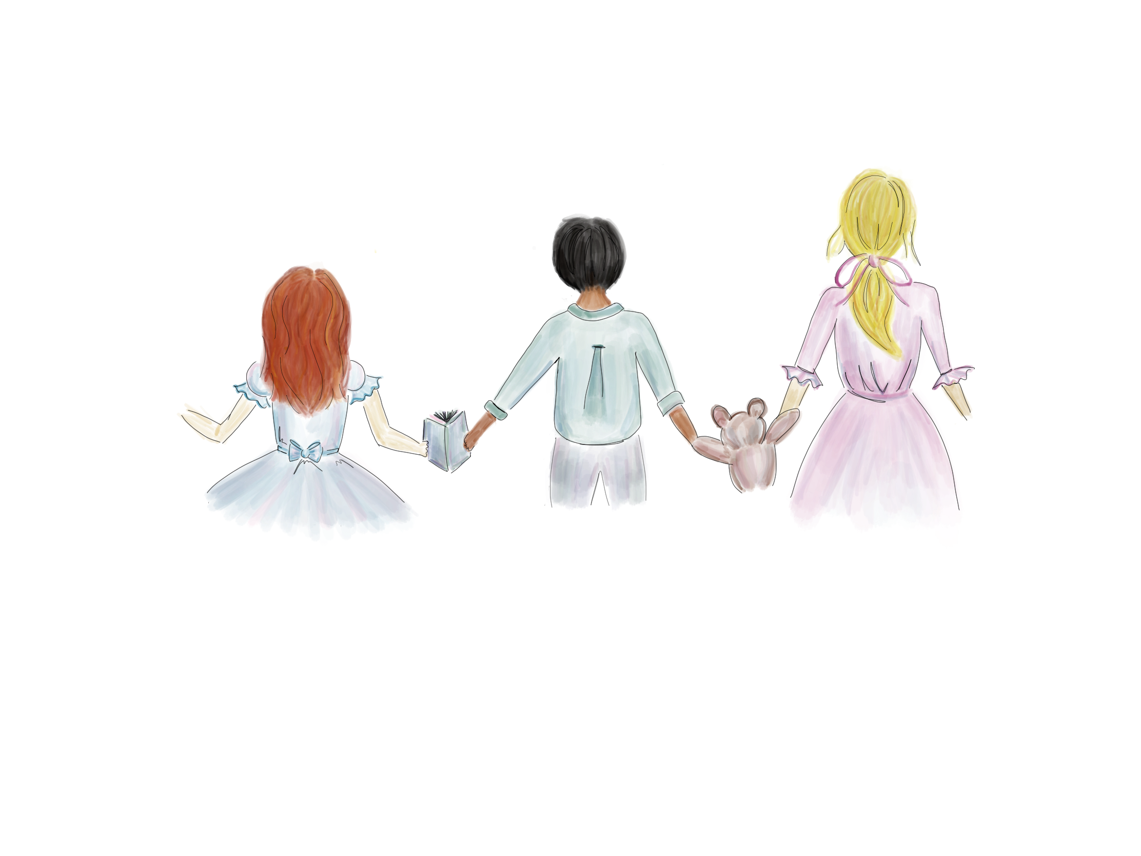
Classy Kids is a Child Development Center in Greenville, South Carolina. The Classy Kids team was looking for an elegant and whimsical logo that embraced childhood. I illustrated a design featuring 3 children at different stages of their lives to focus on the developmental growth that happens at Classy Kids. The clean, dissymmetric font is meant to represent what could be a child's handwriting. I also designed a watercolor background to compliment the design aesthetic of the illustration as well as pay node to the fun, creative elements within any child.

susu jewelry
SuSu Jewelry is a hand beaded jewelry business in Greenville, South Carolina. Susan, the designer, wanted a simple logo that still represented her bright personality and design sense. Choosing a script that had flexible and string like qualities with intricately placed beads on the lettering to represent her beading business gives the effect that her logo could turn into one of her beautiful necklaces itself. Susan also wanted a more simple design to compliment the ornate details in her jewelry.


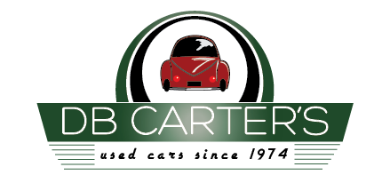
db carter
A family business that's been around since 1945, this used car business wanted to respect the generations of their past with a logo that paired modern elements with stylistic choices of the 50s. Although they ultimately went with the design on the left, I also designed several versions with cars rather than a steering wheel.

richard l. migala, p.c.
Richard Migala is a Personal Injury Attorney in Michigan. As a former Michigan State Trooper, Mr. Migala wanted his logo to incorporate his former career path with his current one.